Painting-Like Rendering Tutorial
Step-1 : Creating a Painting-Like Picture
|
To obtain a good illustration effect it's not sufficient to render the image and apply "artistic" filters, the first step is to study how real life illustrators work and prepare a 3D scene that's suited for the successive filtering.
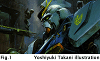
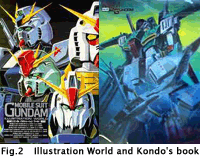
Anime illustrations are basically of two kinds: enhanced and superdetailed images made with a technique similar to that of anime cells - that is dark outlines and plain or shaded colours without brush strokes - or painting-like illustrations. I 'll stick to the latter, and use as a reference the Gundam illustrations by Yoshiyuki Takani and Kazuhisa Kondo (Fig. 1 and 2). I found a lot of good illustrations in the volume "Gundam Illustration World".
|
|
Step-2 : Preparing the scene
|
Lighting is the first thing to tweak: in most illustrations there are not many casted shadows, and even self shadowing is seldom used. Moreover, the effect of casted shadows doesn't look too natural when the picture is "artistized" unless they are time consuming area shadows.
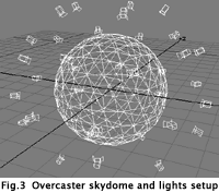
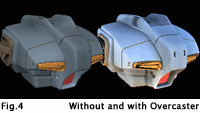
I use a standard two or three lights setup for my pictures, sometimes coadiuvated by an Overcaster scene. Overcaster scenes can be found on Eki Halkka website (http://www.kolumbus.fi/erkki.halkka) together with tutorials, and are excellent for simulating diffuse natural lighting, which is the main lighting technique used by illustrators. While it lengthen the rendering time (there are a lot of raytraced shadows and motion blur must be activated) it helps in hilighting details and provides the right amount of casted shadows without creating harsh contrast.
The idea behind overcasting is to create a "skydome" mith many raytraced light, each targeted to the object, to simulat lights coming from different directions.
|
|
Step-3 : Preparing the surfaces
|
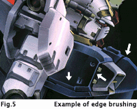
A common technique used by illutrators to hilight the shape of the robots is to lighten and sharpen the edges of the mecha itself. It looks like the dry-brushing technique widely abused by tank kit modelers, and though it's not much realistic on a plastic tank, it looks good in a painted illustration.
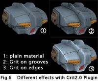
To obtain the same effect with CGI, I used the Grit 2.0 plugin from Eetu Martola. Grit is mainly used to darken the recessed parts of a 3D model, adding what looks like a black wash and enhancing details, but it can be also used "in reverse" to hilight edges. The trouble is that while the darkening effect is clean and neat, there are sometimes problems in tweaking the parameters for edge enhancing, see figure 6 to have an idea of the effect.
The artifacts produced by Grit can spoil the effect of a realistic rendering, but talking of painting-like rendering, this artifact can be ignored, because not only they will be somehow smoothed by artistic filters, but they can also provide a brush strokes look to the enhanced edges.
|
|
|
|
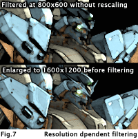
Once the model, surfaces and scene are ready, the entire scene can be rendered. Depending on the final level of detail you want to obtain you can render at different resolution. I use 800x600 for a picture that will be 1024x768 once filtered.
Applying artistic filtering can dramaticaly reduce the details in the image because brushstroke simulation or watercolour filtering tend to "interpolate" the informations from neighbouring pixels, that's why the first thing to do is to resize the rendered piture (for example from 800x600 to 1600x1200) before applying the effects (figure 7).
Another useful trick is to scale down the picture once the effect has been applyed, this is used to introduce some anti aliasing in the filtered picture, smoothing the sharp edges sometimes produced by watercolouring. Now let's talk about the actual filters...
In Photoshop there are two artistic filters that can be used for our work: Dry Brush and Watercolour.
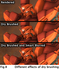
Drybrush blends neighbouring pixels adding "noisy" edges like the ones produced by dry paint, and doesn't alter appreciably the luminosity of the scene. The result sometimes look too "uniform", with large areas almost of the same color. (Figure 8.2)
A solution to this problem is to add a small amount of fractal noise to the picture before enlarging it, then apply drybrush and Smart Blur. Noise and smart blur with a small pixel size setting provide some microdetails to the uniform areas, simulating brush strokes. Best results are obtained with dry brushing if the Grit plugin on grooves or the Overcaster lighting technique is used, these tools are used to underline the model shape and breake dry brush color uniformity as can be seen in Figure 8.3.
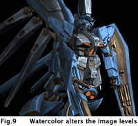
Watercolour simulates the effect of gouache paint, it hasn't the drawback of generating uniform areas, but as you can guess from Figure 9 composition, it can alter significantly the global light/dark balance of the image. The parameters can be tweaked to reduce (or artistically enhance) this effect, but even with low shadows and no texturing the effect is to boost light areas and deepen darker areas.
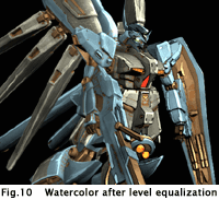
The effect of this filter is widely dependent on the level range of the original picture, a good idea is to try to automatically adjust levels before applying the effect. This can sometimes alter the cromaticity of the original rendering, but the results of watercolouring after adjusting the levels are usually worth some post-filter tweaking. In Figure 10 you can see that after altering the levels the picture hasn't changed its light/dark balance after applying Watercolor.
|
|
|
|
Here are some examples and larger images of artistic filtering, each picture has a short comment.
Original Rendering: This is the picture as it comes out of Lightwave. It's quite dark because of low lighting level, and you can see clearly the artifacts produced by Grit2.0 on the bright edges.
Levels Equalization: After applying the auto levels function the image has changed a lot, but this is necessary to obtain the best results from watercoloring.
Direct Watercolor: Applying watercolor directly at 800x600 removes a lot of details from the original rendering; minor details are covered by paint stains.
Rescaled Watercolor: Scaling up to 1600x1200, watercoloring and then scaling back to 800x600 helps in keeping finer details and provides anti-aliasing for the paint-like picture
Dry Brush Filtering: I used watercolor for this picture instead of dry brush because the surface attributes lack the "dark groves" effect provided by Grit2.0; applying dry brush on this rendering produces an overall too omogeneous image.
Level Re-equalization: After the watercolor effect has bee applied the levels can be tweaked to recover the original light/dark balance, this is way better than applying watercolor to the unequalized rendering.
|

|