Hi-Nu Satellite View Tutorial
|
|
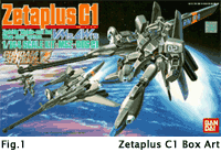
I started thinking about a good image with a Gundam flying in space, and came across the box art of the Zetaplus-C1 modelkit from BanDai, as you can see in Fig.1 the illustration portraits a MSZ-006C1 flying above the atmosphere of a planet. I decided to build a similar scene with my RX-93-u-2 Gundam.
First of all I had to reproduce the pose of the Zetaplus with my Hi-Nu model, thankfully enough the skeletal system of the model is enough flexyble, I only had to add a couple of null parent objects to allow the rotation of the body with respect to the bottom.
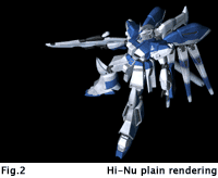
Experimenting with lighting, custom materials and reflection plugins I obtained a look that quite matched what I had in mind: not a realistic, metal like appearence, but something closer to an artistic illustration. The first rendering was just a shot of the Hi-Nu in the correct pose, with no background, to check the composition of the whole image.
|
|
|
|
|
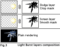
As you can see the model has not any light burst from its engines, this element was added in Photoshop by means of a simple composition. A first layer was overimposed on the plain rendering, with a blank drawing area and a mask area taken from the rendering alpha channel. I drew the light burst with airbrush and smudge tools, added some yellow colour touches and a white inner glow with color dodging airbrush, then the whole layer was duplicated and the mask locally smoothed to let some of the light appear over the robot body. The upper layer had the "crisp" mask and a "color dodge" blending mode, while the lower one was in "screen" mode with the slightly blurred mask (fig.3)
|
|
Step-3 : Planet & Atmosphere
|
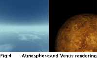
I usually generate planets by means of enormous 3D spheres with a suitable texture mapping and shading, but this time I followed a different path, building the planet too with a composition. I already had a good atmpshere generated in Lightwave, but this was a 480x640 picture, so I had to use some stretching to adapt it to the aspect ratio of the new image. As the atmosphere line was flat in the original work, I decided to deform it by means of Photoshop "shear" tool.
To add some detail to the planet I composed the atmosphere on top of a rendering of Venus, this was obtaind through a proiection image of Venus' surface mapped on a sphere. Some tweaking was needed here too, this rendering the picture more blurry, but that was not a real problem as the planet image was only going to add some "movement" to the otherwise plain atmosphere.
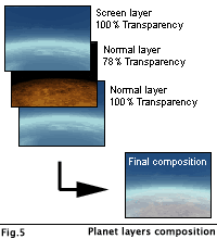
The final composition is based on three layers: the base atmosphere, a layer for the planet, with a medium level of transparency, and another atmosphere layer on top in "screen" blending mode. The transparency of the second layer, together with the screening of the upper one were necessary to provide a gaseous and immaterial appearence for the planet.
|
|
|
|
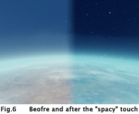
From figure 4 or 5 you can see that the image is not looking as a space scene at all, it lacks the darkness and star field that are distinctive features of space settings. I generated a star field picture with Impulse Imagine, this package provides excellent results, and composed it on top of the planet layers using a "screen" blend mode.
To change the darkness of the picture I did not alter the levels, but added a layer in "soft light" mode, this layer had a not too smooth gradient from black to aqua green, thus providing the darkening of the sky and adding a beautiful greeny tint to the atmosphere.
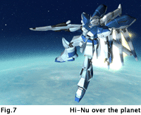
Once the backdrop picture was ready a new rendering of the plain model with the new background was produced, this provided a good anti-aliased picture and eliminated the dark outline of the model that was visible with the previous rendering. A duplicate of the Hi-Nu layer was lightened in blue and then slightly faded to the "plain" one to convey a blue tint to the lower parts of the robot.
This helped the "fusion" between the Hi-Nu and the backdrop.
|
|
|
|
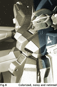
At this stage the picture quite closely resempled the original box art, but I wanted to push thing a step further and add that noisy desaturated look that's typical of satellite pictures in common SF. I used the "hue/saturation" control in "colorize" mode to get the correct sepia/green tint [Hue:54 Sat:15 Light:0] and a further slight desaturation to clear up the image, then the white noise was added.
This can be obtained in many different ways, the most straightforward being the "add noise" filter, used in monocrome mode. I decided not to use this technique, and rather employ the "film grain" plugin, this allowed me to slightly "burn" the lighted part of the picture and have a finer control on saturation without altering the levels. The setting used are [Grain:3, Hilight Area:10, Intensity:1]
To add some tint to an otherwise too plain picture I recycled the full color composition: combyning it with the colorized and noisy version helped in recreating a soft colour picture without altering the gamma and contrast, and retaining the original noisy aspect. I used the "soft light" blending mode to obtain this effect.
|
|
|
|
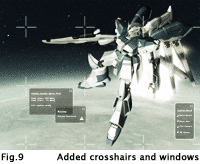
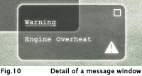
To enrich the visual aspect of the picture and let it be more credible some details were added to produce the impression that the entire scene was seen through the monitor of a control room. First came the insertion of mini crosshairs, blended with "screen" on top of the image, and then some little OS-like windows were spread over it.To easily manage different solutions for the windows disposition I created a custom Photoshop action that, starting from a rectangular selection area, produces a window with the correct shape, blending scheme and transparency setup. A soft glow effect was applied to the text and glyphs of the windows and to the border too. With this arrangements the image is completed. You can see a thumbnail in figure 9, while the Hi-Nu gallery hosts the final 1024x768 work.
|
|

|