|
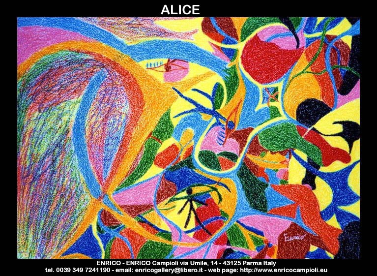
technique: wax pastel
size: cm 50 x 70
year: 1996
painting not available
review: Some titles of his paintings evidently disclose their joyful goal; for instance "Alice", a 1996 pastel painting (owned by the artist), created for his daughter Fabiola, and which takes the viewer into a fabulous world: Wonderland. We could analyze this work as a meaningful unity; this would lead us to consider its many syntagmas, but the meaning attributed to the different syntagmatic units will doubtlessly be arbitrary. We must avoid to be conditioned by the referential illusion which would lead us to consider a painting as a simple reflection or fragment of real or imaginary world. Before considering the relation between painting and the outside world, we must examine painting's own nature. In our western culture people feel a certain receptive expectation, when they come to read a figurative pictorial work. This way to read paintings leads us to point out opposites, for example: animals against vegetables, terrestrial kingdom against celestial one, animates against inanimates, dark values against bright ones, ascending lines against descending ones. As far as "Alice" is concerned, this painting is like a closed space shaped by a harmony of colored zones, marked by waves and loops, to be considered at the same time as chromatic and linear syntagms. It is possible to individuate two different sides, the right side and the left one, which are antithetic to one another, since they are characterized by different syntagmatic units. The right side is shaped by a big chromatic liveliness and eccentricity. Syntagms consist of sinuous lines and of the shapes they delimit. They are different in sizes, typologies and also in colors. The background is primary yellow; which is used in the same way as the gold in the Middle Age, that is, as a representation of divine light, to create a "wall", to make the perspective depth unperceivable. Sinuous lines are supposed to represent the female element, detected in its essence, by using primary colors as red, yellow and blue. The choice of the title too clearly shows that the prevailing feature is feminine. In the left side it is possible to notice a certain sobriety, created by a wide azure background, realized in a way to make pastel strokes to come out very clearly. From this background starts the only one sharp shape among a crowd of sinuous and soft lines. The main shape which characterizes this side of the painting is the cusp, meeting and crossing a female loop, colored primary blue, and fighting or matching with the male cusp, colored secondary orange, which comes from two primary colors: yellow and red. The central zone of the painting seems a prosecution of the right side.
by Ilaria Azzoni


|