Isle of Dread Cover Retrospective
By I. “Meandrathel” Calvin
https://en.wikipedia.org/wiki/File:Isle_of_Dread.jpg
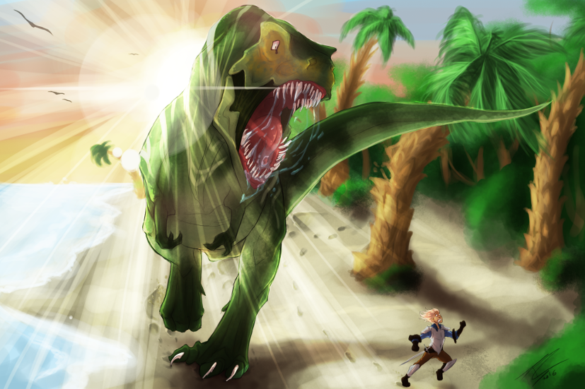
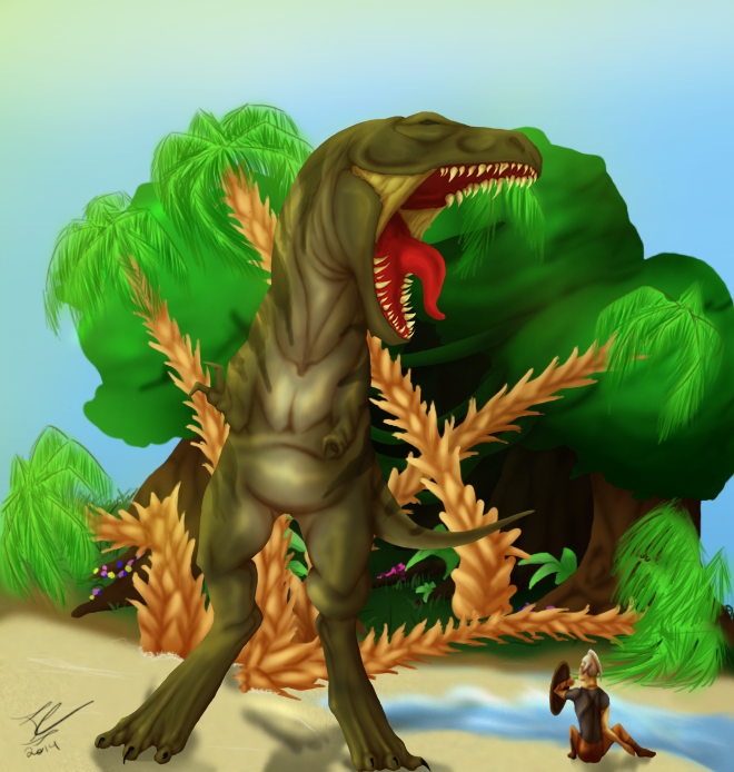
Aaaaahhhhh the anatomy. I like being brutal with my old pictures but then I remind myself that future me is gonna do the same thing and my ego gets knocked down a few pegs.
The original picture’s dino is so disproportionate. Not only is his body freakishly small and out of place in comparison to his limbs, but what is happening with his tail? That tiny thing cannot balance his body. His shoulders are nowhere near big enough to support that giant head, his toes are like little pinheads... so many problems.
The head is also not as defined as the newer picture’s, of which I am proud of. It’s still got problems, but it’s a massive improvement.
AAAAAA I’LL CHOMP YOU LITTLE MAN vrs. Look at me roar I’m very scary
I’m proud of both of these pictures, pose wise, but I went for a much more dynamic setup in the newer one and I think it puts a lot more life into the picture.
The original’s colors are much more saturated, the green and brown in the trees almost neon-y and the red in the mouth a shade a healthy dinosaur should not have. The new picture is much more color accurate- using muted and bright tones in moderation (or at least I tried). Judging what color looks right, and where, is all due to experience though, you get a better eye for it the longer you spend with colors. In two years I’m gonna be complaining about how bright those teeth are.
In the original picture I used lines but removed them for the end product; Mainly relying on shading to define the dinosaur and human. In the updated picture I did not remove the lines though-this is the one thing I’m unhappy with, as the picture isn’t as cohesive with the background because of this.
The background in the old picture was my first attempt at a finished, cleaned background. I struggled so much with everything, from the globby trees and (disgusting) palm fronds to the sand. At the time, it was the best background I had ever done-so similarly, I pushed myself on the newer background. I still hate trees and palm fronds. I was able to give the sand more texture and depth however, define the water, and make the sky more realistic.
And of course, the part that I am the most proud of-the lighting! When I made the original, I hadn’t fully developed my shading skills yet- and so the shading was focused only on the creatures, not carrying over to the background. It was also soft, especially the highlights. In the new picture, I went all out on the lighting, putting the sun right behind the head, trying out lens flares and carrying the lighting throughout the picture. My shading technique has also improved, I cell shade first and then soften the edges with a soft brush.
Overall.... I’m very happy with the improvement I’ve made over two years. I’ve made massive strides in everything and I’m looking forward to seeing what it’ll look like in two more years!
~Meandrathel